The mark. And the name.
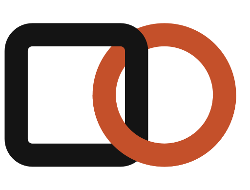
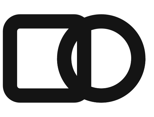
The Bond is a square machine link interlocked with a round clay human link — machines and people, joined by trust. It is the whole idea in one shape. Always place the mark from this kit; never redraw it, never recolour the clay ring, and keep it flat — no shadows, gradients or 3D.
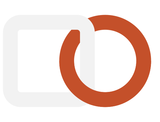
On light backgrounds the mark is ink and clay; on dark, the square turns stone and the clay ring holds. The name is a wordmark, always written lowercase — hannu — in headlines, running text and buttons alike. The only capital H is the legal entity, Hannu Limited. Products take the same lowercase name plus a plain noun: hannu Tasks, hannu Workflows, hannu Loops.
Download the mark (SVG)



Represent hannu with confidence.
Grab the mark, keep the name lowercase, and reach out for anything this kit doesn’t cover — other formats, the full guidelines, or a press enquiry.